
Unlocking Educational Insights: A Deep Dive into Data-Driven School Performance
In today's evolving educational landscape, understanding how our schools are performing is paramount.Parents, educators, and policymakers alike seek clear, actionable data to guide improvements and ensure every student thrives.
While many states strive to provide this transparency, the effectiveness of their reporting tools can vary significantly.
This article explores the critical role of comprehensive data reporting in education, examining how well-equipped states are to showcase student progress and identify areas for growth, particularly in the wake of recent global challenges.
We'll delve into what makes a truly effective educational dashboard and what lessons can be learned from states that excel in presenting vital school data.
The Crucial Role of Longitudinal Data in Education
The academic journey of a student is not a snapshot; it's a continuous progression.Therefore, understanding educational performance requires looking beyond a single year's results.
Longitudinal data, which tracks student or school performance over multiple years, offers invaluable insights into trends, growth, and the impact of interventions.
This type of data is essential for identifying whether academic gains are sustained, whether setbacks are being addressed, and how effectively schools are navigating challenges.
Why Year-Over-Year Comparisons Matter
Imagine a student receiving an "A" in a class.While this is positive, it doesn't tell the whole story.
Did the student consistently perform at this level, or was this a significant improvement from previous years?
Similarly, a school might show average test scores for a given year.
However, without seeing how those scores have evolved from pre-pandemic levels, it's difficult to gauge the true impact of disruptions on learning.
Longitudinal data allows us to: * **Track genuine academic growth:** Observe how students' skills and knowledge develop over time. * **Identify persistent challenges:** Pinpoint areas where students or schools are consistently struggling. * **Evaluate the effectiveness of strategies:** Determine if new teaching methods or support programs are yielding lasting positive results. * **Understand the long-term impact of events:** Assess how significant events, like a global pandemic, have affected educational trajectories.
The Data Gap: A Missed Opportunity for California Schools
Recent analyses have highlighted a significant gap in how some states present their educational data, particularly concerning longitudinal trends.For instance, a comprehensive report examining state school report cards found that while many states collect vast amounts of data, the way it's presented often hinders public understanding of long-term performance.
This is particularly concerning when considering the academic disruptions caused by recent global events.
In the case of California, a prominent report indicated that its public-facing dashboard, a primary source for school and district performance data, struggled to effectively display this crucial year-over-year information.
This lack of clarity makes it challenging for parents and stakeholders to gain a realistic perspective on how schools are progressing, especially when compared to pre-pandemic benchmarks.
The report suggested that this difficulty in accessing and interpreting longitudinal data meant the dashboard wasn't fully serving its purpose as a tool for informed decision-making.
Designing Effective Educational Dashboards: Lessons from Leading States
The effectiveness of a state's educational dashboard hinges on its ability to present complex data in an accessible, understandable, and actionable format.Several states have demonstrated best practices in this area, offering valuable lessons for others looking to enhance their reporting.
Key Features of a High-Performing Dashboard
What makes a dashboard truly shine?Research and expert analysis point to several critical elements: * **Clear Visualization of Trends:** The ability to see multiple years of data side-by-side, often through charts and graphs, is paramount.
This allows users to quickly identify patterns and shifts in performance. * **Comprehensive Metric Coverage:** Reporting on a wide range of indicators, including academic achievement (English language arts, math, science), student growth, chronic absenteeism, graduation rates, and English learner proficiency, provides a holistic view. * **User-Friendly Navigation:** The dashboard should be intuitive and easy to navigate, allowing users to find the information they need without extensive technical expertise. * **Accessibility of Raw Data:** While visualizations are key, providing access to the underlying data allows for deeper analysis by researchers and dedicated stakeholders. * **Contextual Information:** Explanations of the metrics, rating systems, and the significance of different data points are crucial for proper interpretation.
California's Approach: Strengths and Areas for Improvement
California's dashboard has made strides in highlighting disparities in achievement across various student groups.This focus on equity is a commendable aspect, allowing for a clear view of how different demographics are performing.
The use of a color-coded rating system (e.g., blue for highest performance, red for lowest) aims to signal progress or concern at a glance.
However, the report indicated that the dashboard's design, while prioritizing equity, sometimes makes it difficult to discern longitudinal trends.
For example, a significant improvement in a metric might be masked by the overall color rating if the starting point was exceptionally low.
Without easily accessible year-over-year comparisons, it can be challenging to fully appreciate the progress made or the persistent nature of certain issues.
The state's approach, which emphasizes districts' self-improvement, is a valid philosophy, but the presentation of data needs to support this by clearly showing the journey over time.
Leading by Example: States with Exemplary Dashboards
Some states have been recognized for their exceptional data reporting.These often feature: * **Interactive Charts:** Allowing users to select specific years, student groups, and metrics to explore data dynamically. * **Integrated Reporting:** Combining multiple data points into a cohesive narrative that tells a story of school performance. * **Focus on Growth Metrics:** Emphasizing not just proficiency levels but also how much students are learning year over year. * **Clear Explanations of Methodology:** Transparency in how data is collected, analyzed, and presented builds trust and understanding.
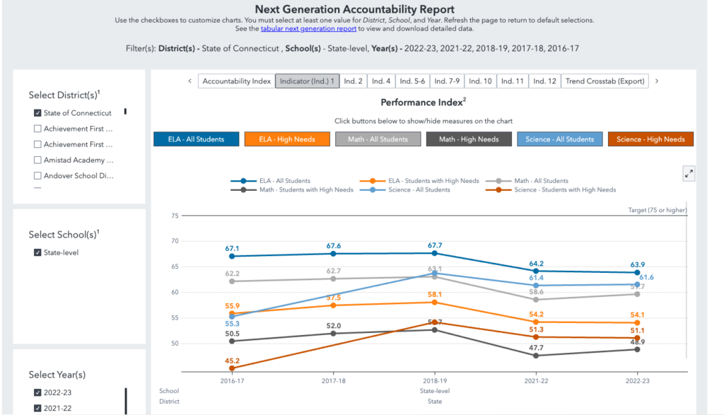
For example, states that present five years of results through clear bar charts and line graphs for numerous performance measures offer a much clearer picture of trends.
This allows stakeholders to see the impact of educational policies and external factors over time, providing a more robust understanding of school effectiveness.
The Impact of Data Transparency on Educational Outcomes
The way educational data is presented has a direct impact on how it's understood and utilized.When data is transparent, accessible, and easy to interpret, it empowers a wider range of individuals to engage with educational issues.
Empowering Parents and Communities
Parents are key partners in a child's education.A well-designed dashboard can equip them with the information needed to: * **Understand their child's school's performance:** Beyond grades, they can see how their school compares on key indicators like student engagement and academic growth. * **Advocate for improvements:** Armed with data, parents can have more informed conversations with school leaders and district officials. * **Make informed choices:** For families considering school options, transparent data can be a crucial factor.
Informing Policy and Practice
For policymakers and educators, robust data reporting is indispensable for: * **Identifying systemic issues:** Spotting trends that affect entire districts or the state. * **Allocating resources effectively:** Directing funding and support to areas with the greatest need. * **Developing targeted interventions:** Designing programs based on specific performance gaps identified through data. * **Measuring the impact of educational reforms:** Understanding whether new policies are achieving their intended outcomes.The Challenge of Data Usability
While many states collect a wealth of data, the challenge often lies in its usability.A dashboard that is difficult to navigate, presents data in overwhelming tables without clear visualizations, or lacks longitudinal context can inadvertently obscure important information.
This can lead to a disconnect between the data collected and the insights gained, potentially hindering progress.
The goal should always be to transform raw data into meaningful knowledge that drives positive change in education.
Navigating the Future of Educational Data Reporting
As the educational landscape continues to evolve, so too must the tools we use to measure and understand school performance.The focus on data transparency and usability is more critical than ever, especially as we continue to address the long-term impacts of recent global disruptions.
Key Takeaways for Enhancing School Data Dashboards
Based on the analysis of state reporting practices, several actionable insights emerge for improving educational dashboards: * **Prioritize Longitudinal Data:** Make year-over-year comparisons a central feature, using clear visualizations that highlight trends and growth. * **Simplify Navigation and Presentation:** Design interfaces that are intuitive for all users, including parents, educators, and community members. * **Ensure Comprehensive Metric Coverage:** Include a balanced set of indicators that reflect academic achievement, student well-being, and school climate. * **Provide Context and Explanations:** Clearly define metrics and explain the significance of different data points and trends. * **Embrace User Feedback:** Regularly solicit input from stakeholders to refine the dashboard's design and functionality.The Role of Mentofy in Data-Driven Learning
At Mentofy, we understand the power of data in transforming education.Our platform is designed to empower learners, educators, and institutions with the insights they need to succeed.
We believe that accessible and actionable data is fundamental to fostering a more equitable and effective learning environment for all.
By providing tools that facilitate understanding and progress, Mentofy supports the global community's journey towards data-informed educational excellence.
Conclusion
The effectiveness of a state's educational dashboard is a critical component of its commitment to transparency and accountability.While many states, including California, collect vital data, the way this data is presented can significantly impact its utility.
The emphasis on longitudinal data, clear visualizations, and user-friendly design is paramount for empowering parents, informing policymakers, and ultimately driving positive outcomes for students.
By learning from the best practices of leading states and continuously refining our approaches, we can build educational reporting systems that truly illuminate the path to academic success for every learner.







 Explore AI Teaching Tools
Comments (0)
Please login to comment
No comments yet
Be the first to comment on this article